
Part of my job is finding maps, satellite photos, aerial photos and such for projects. I look around to see what is available, and use it to help document projects. I also think its fun, which is always nice. I found a remarkable comparison between a satellite and an aerial photo.

This is a satellite image of my house, with "color enhanced" imagery, so everything that is red would normally be green in real life (I wonder why it is called color enhanced?). This image was free from the NYS GIS system on the net. In some places the quality is much better. Google Earth is much the same, with some places superb, and other places a messy blob of green and brown. We're in the blob zone, so I wouldn't bother looking.

This is an aerial photo I found of my house, reduced in size to 20% of the original. The true color and the really good detail make a huge difference in the quality of the picture. There is a cost to use the system, but I was able to look with a free trial and get this. This is actually about 10 separate images put together in Fireworks from screen prints, so it was time consuming to get this image done.
So, I have a pretty clear example of the difference, but I don't know where the line for work can be drawn. Is it worth a few thousand dollars a year to have this level of quality for some projects? How often would we need to have something like this? Sure, its great to be able to put up an image like this, and would make a report look pretty slick, but in most cases its more than we would need.
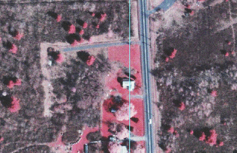
This is a satellite image of my house, with "color enhanced" imagery, so everything that is red would normally be green in real life (I wonder why it is called color enhanced?). This image was free from the NYS GIS system on the net. In some places the quality is much better. Google Earth is much the same, with some places superb, and other places a messy blob of green and brown. We're in the blob zone, so I wouldn't bother looking.
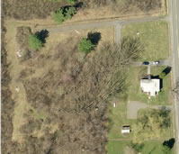
This is an aerial photo I found of my house, reduced in size to 20% of the original. The true color and the really good detail make a huge difference in the quality of the picture. There is a cost to use the system, but I was able to look with a free trial and get this. This is actually about 10 separate images put together in Fireworks from screen prints, so it was time consuming to get this image done.
So, I have a pretty clear example of the difference, but I don't know where the line for work can be drawn. Is it worth a few thousand dollars a year to have this level of quality for some projects? How often would we need to have something like this? Sure, its great to be able to put up an image like this, and would make a report look pretty slick, but in most cases its more than we would need.
posted by Scott | 9:54 AM
![]()
0 Comments:
Post a Comment
<< Home